
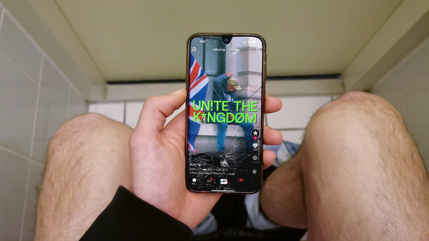
“Journalism is moving through a fundamental shift,” says James Sedgwick Yeung from Overview, a strategy and brand office working with founders in emerging industries (such as medical cannabis, financial and medical tech and creator economies). “Audiences are no longer only looking to institutions to tell them what is happening. They are finding news through platforms, creators, documentaries, clips, conversations and people they feel some connection to. Authority is no longer inherited from an institution.” This is the basis of Human, a new journalism outlet for audiences that yearn for access, honesty and the ability to have complex issues feel understandable in a world that has become harder to explain. Built for that radical shift, the UK-based documentary studio Zandland is leading the charge with Human, factual storytelling created for an era “where understanding matters more than judgment”. With Overview leading on its branding, it’s set out to become the new Vice or a competitor for the in-depth storytelling from the eternally viral Channel 5.
Everything in the visual strategy is rooted in ‘credibility’, which is why the identity takes inspiration from Jeffersonian transcription – when punctuation and glyphs interrupt traditional written communication. It’s a system used in conversation analysis to capture not just what people say, but how they say it – every pause, overlap, hesitation, emphasis. “This became the foundation for Human’s brand world. Rather than polishing every story into a clean institutional voice, the identity embraces the texture of expression,” says James. “A design system that feels observed, not imposed. Edited, but not over-authored. Human, because it allows people to sound like themselves.” The typeface is built from Saans by Display, which already has all of the glyphs Overview needed to demonstrate expression, it was just about how to colour and use it.