Did you know there’s a charity that specifically supports mental wellness in the advertising, media and marketing industry? NABS has been around for over a century and it’s just got a new identity courtesy of creative agency Nice and Serious.
Aiming to deepen NABS’ impact and visibility, the rebrand is built around the idea of ‘The Unstoppable Ally’ – as NABS seeks to focus on advancing mental wellness in industry culture, making them more than just a support service. It launched on Wednesday, in time for Mental Health Awareness Week 2025 (see our piece on The Coffee Foundation for more branding/mental health crossover).
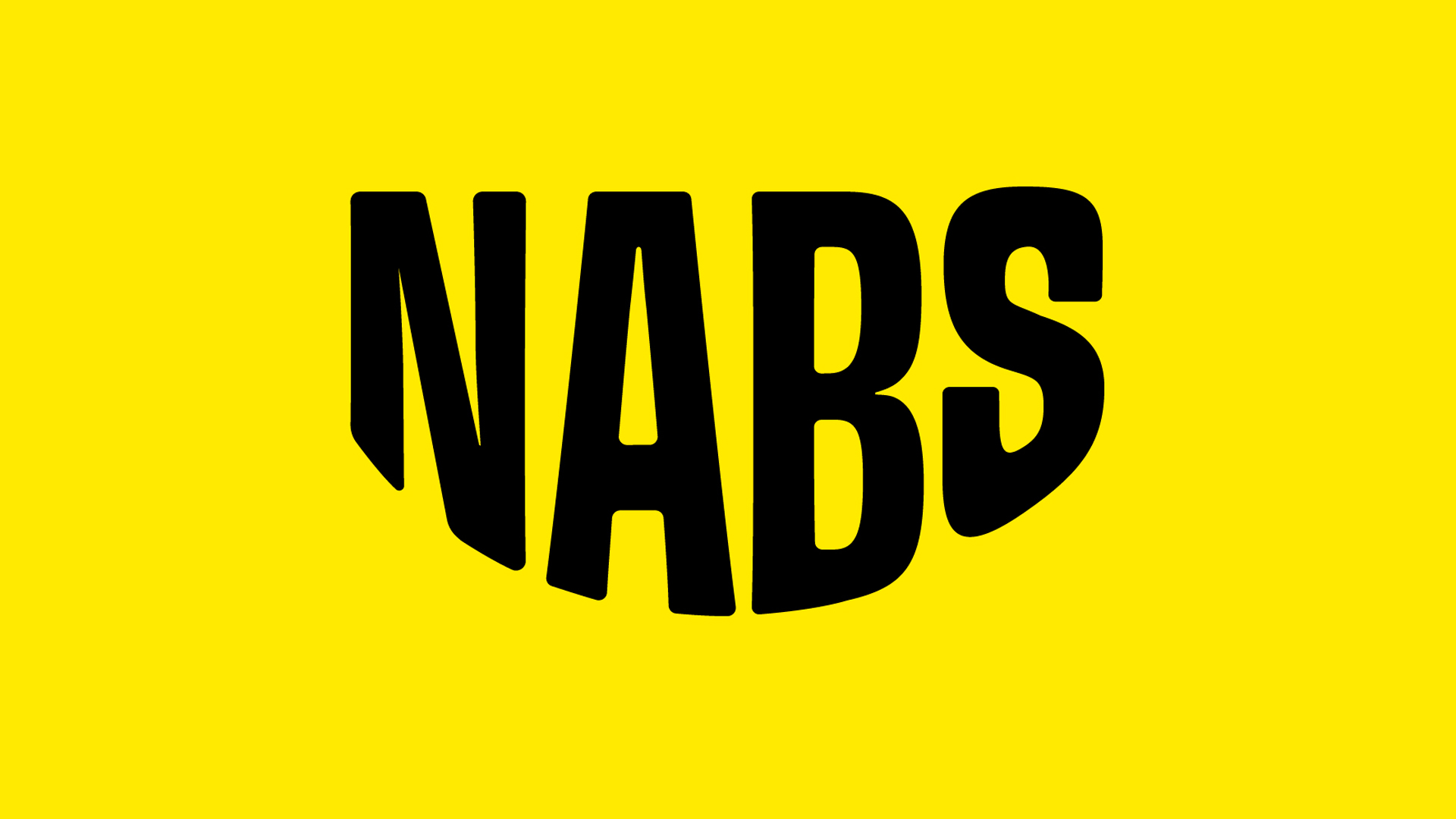
The logo, which Sam Perkins, design lead at Nice and Serious, says emerged through play and experimentation, is a bold wordmark with the letters arranged in a smile-like shape. Amazon has just tweaked its smile logo, does it need to watch out?
You may like
Like Amazon’s smile, this one is also subtle, which I like, because it might feel over the top to have a grinning logo represent a mental health charity.
Image 1 of 4
(Image credit: Nice and Serious)(Image credit: Nice and Serious)(Image credit: Nice and Serious)(Image credit: Nice and Serious)
NABS’ new brand puts it front and centre of mind as the go-to resource for anyone dealing with the highs and inevitable lows of working in the creative industries. NABS is positioned as a “friendly guide who understands the challenges of the industry, champions mental wellness and stands firmly in your corner”.
The visual identity is grounded in the idea of being hands-on and on hand to help, says Sam. A helping hand appears throughout the identity, supporting the other assets and providing a visual nod to helping hands.
The colour palette is vibrant, with an unusual mix of a bright yellow and a lighter yellow working together.
Daily design news, reviews, how-tos and more, as picked by the editors.
Image 1 of 4
(Image credit: Nice and Serious)(Image credit: Nice and Serious)(Image credit: Nice and Serious)(Image credit: Nice and Serious logo plus bicycle drawing and photo)
The typography is accessible to all, with the use of Lexend, an ultra-legible typeface designed to improve reading proficiency, Sam explains.
“The illustration style – with dotted halftone patterns, roughened brushstrokes and offset textures – honours NABS’ long history in media,” they add.
“All elements come together in a flexible framework that allows the brand to adapt to different audiences while always feeling distinctly NABS.”
(Image credit: Nice and Serious)
Lily Peters, associate creative director at Nice and Serious explains how the new look came about: “Through immersive workshops with the NABS team, their brand purpose emerged naturally: to advance the mental wellness of our industry, so we can all keep moving forward.
“NABS are hands-on and on hand to help. This truth is at the heart of the new identity and heavily influenced the tone of voice – Be Kind, Bring a Fresh Perspective, Always Ready to Roll, and In Your Corner. These traits give NABS the chance to flex between degrees of compassion and challenge, for individuals and the industry.”
NABS website before its redesign (Image credit: NABS)
Why did NABS need to rebrand? Lou Thompson, marketing director of NABS says: “After eight years, our previous brand no longer reflected our proposition, energy and breadth of support we now offer.” (See the previous homepage above.)
“As mental health challenges continue to rise, it’s vital that more people across the advertising, media, and marketing industry are aware of NABS and the help available to them. Our aim is to reach everyone who may need us and to build a stronger, future-proofed community of supporters.”
(Image credit: Nice and Serious)
In terms of what the NABS team were looking for in a brand, it was all about communication. “We needed a brand that clearly and compellingly communicates our purpose to our diverse audiences – both visually and verbally,” continues Lou.
“Nice and Serious have delivered exactly that, creating a brand blueprint that brings our mission to life with a vibrant, warm, and inclusive identity. All of us at NABS are excited to embrace this unstoppable new brand as we work to advance the mental wellness of even more people across our industry.”
I think this is a successful rebrand, which should highlight NABS mission and enable them to help more people. Nice one, Nice and Serious.
For more information, see NABS and Nice and Serious.
For more fantastic branding, check out the winners of the Brand Impact Awards.
Source link
