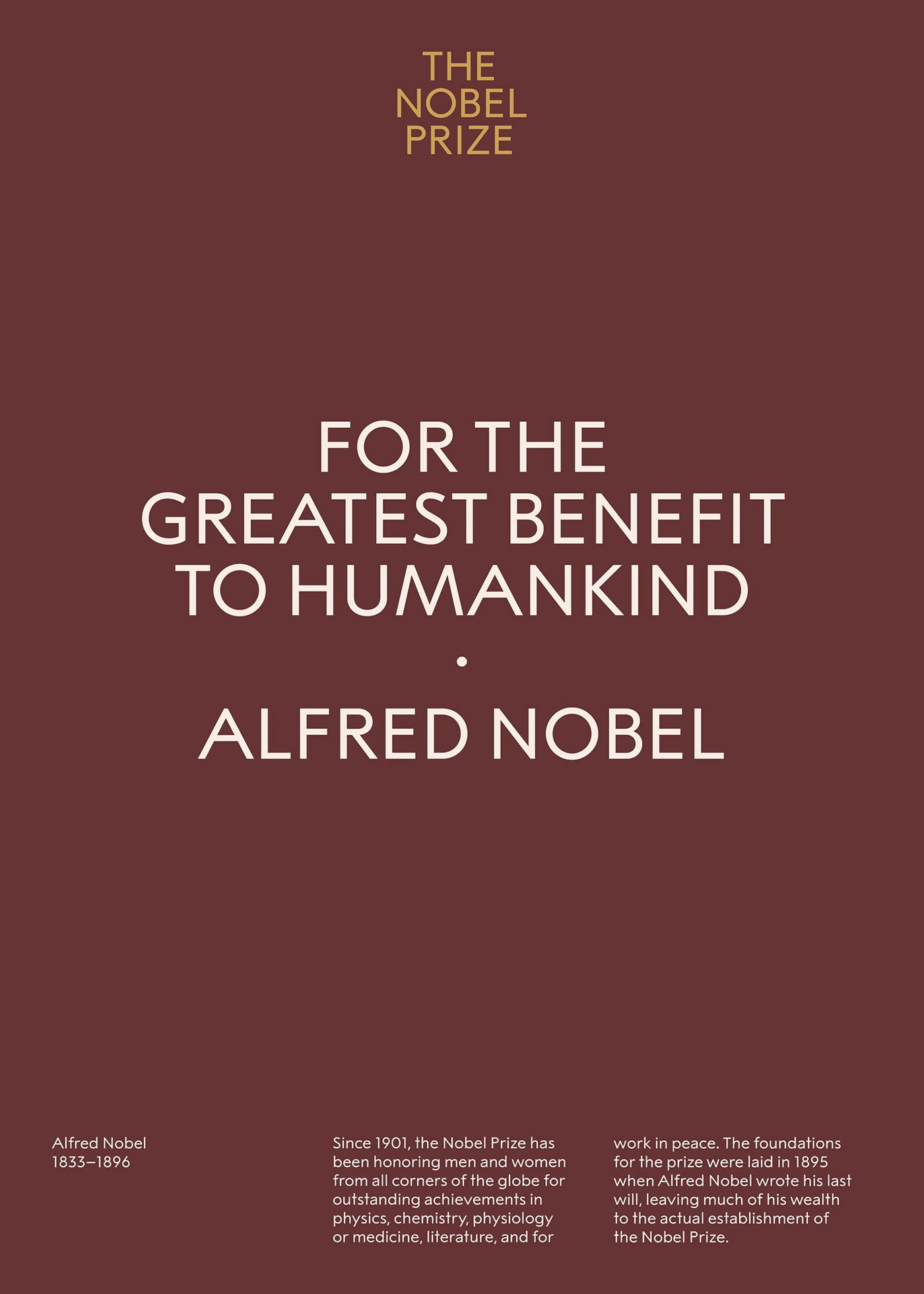
The uniquely drawn typeface, Alfred Regular, originates from the letters engraved in the golden medal. As the primary font and also used in The Nobel Prize wordmark, it will gain recognition in any touchpoint.
The upper case lettering is based on classic geometric shapes, but with varying width and a high waist, giving it a unique and ownable character. The lowercase letters are designed in the tradition of early 20th century sans serif typefaces, like Akzidenz-Grotesk, Berthold Grotesk and Futura.
Alfred Sans was developed in parallel with the secondary font, Alfred Serif. Both typefaces are designed to fit together and complement each other, functionally as well as aesthetically with a focus on readability and thus secures long term usage.
