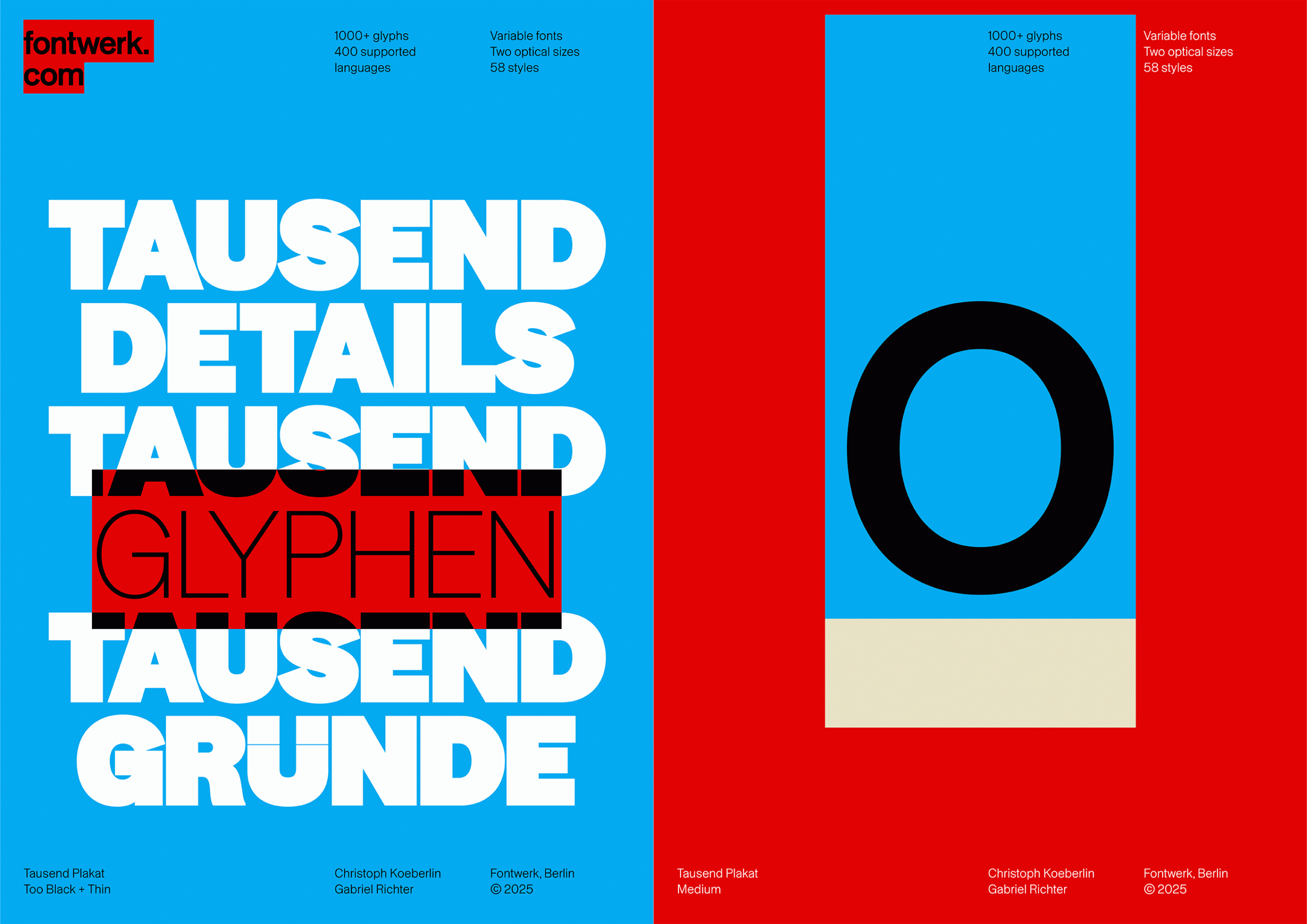
So what exactly does Tausend offer? In short, flexibility. The collection spans six subfamilies, from the standard version to Plakat, Soft, Plakat Soft, Stencil and Shaded. Each has its own texture and tone and uses variable font technology, meaning weight, width and style can be adjusted on the fly, with 1000 options built in.
Better yet, we found that Tausend is designed with usability in mind. Optical sizes are built into the family, which means text looks just as good at six point as it does on a billboard. The typeface conforms to DIN 91379, a character encoding standard that ensures compatibility with all official EU languages and several others beyond. For brands, institutions and organisations working across borders, it’s a practical detail with real creative implications.
But there’s personality here too. Tausend is described by Koeberlin as “brutally honest, proud and confident,” traits that come through clearly in the design. At lighter weights it reads as soft and spacious and at heavier settings, particularly the ultra-bold Too Black styles, it becomes denser and more expressive. Particularly, the Shaded and Stencil variants add a layer of experimentation, with options for shadow play, texture and contrast.
