
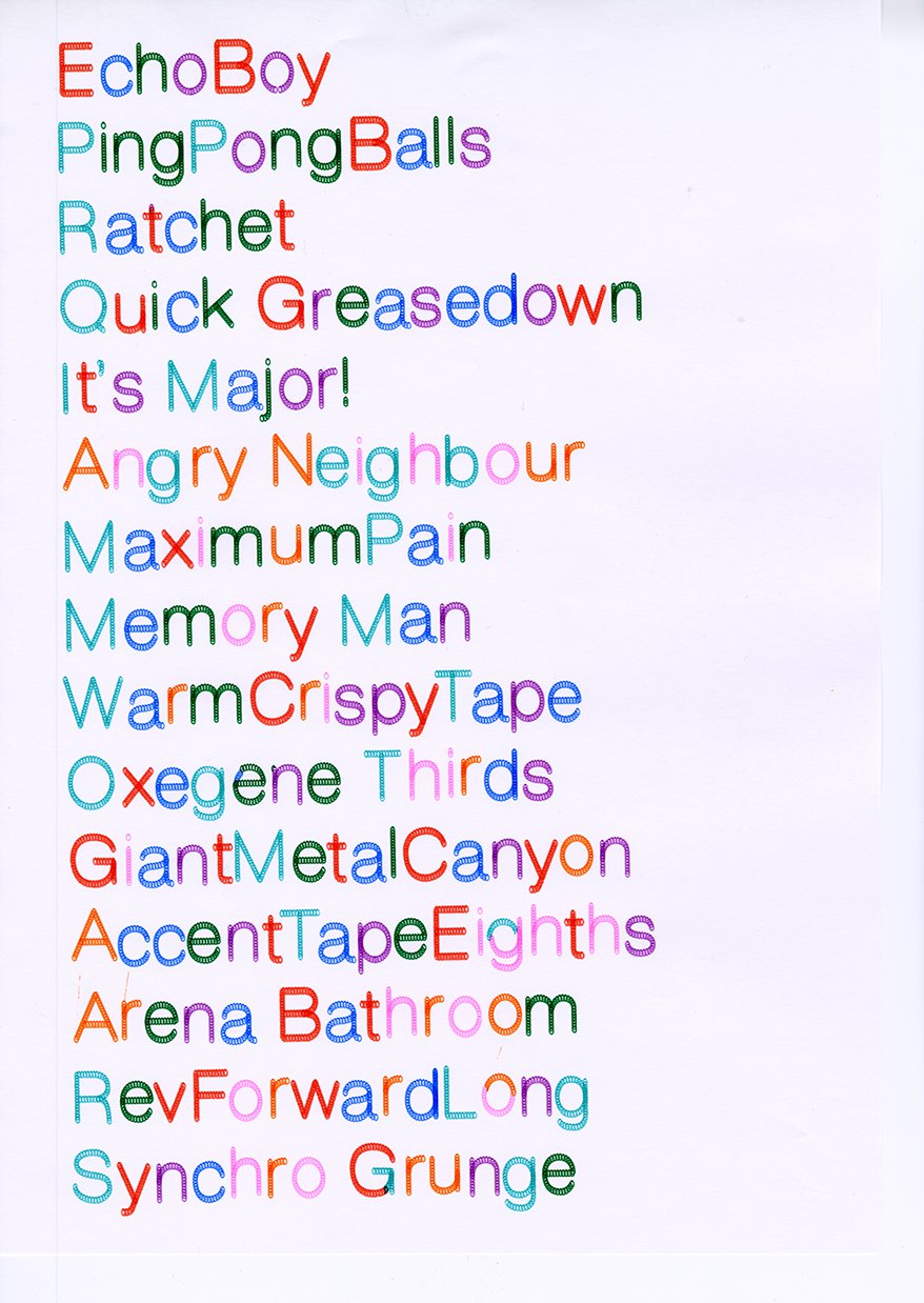
With image-based media sinking a little bit further down the AI-slop slope every day, we find ourselves yearning for the analogue simplicity of our childhood drawings. Blow pens, which allows for randomness and freckles of felt tip spraying across the page, and multicoloured graphite pencils that allow you to draw in rainbow streaks. One particular forgotten box of artistic goodies you may have had is the spirograph, a collection of stencils that allows you to draw eccentric patterns and overlay several times with different colour pens, creating something trippy in the process. In Stanley Plowman’s new typeface Garble and its accompanying zine, the creative possibilities of the pen plotter and analogue type design throws us back to the days of infinitely clarting about with all of the tools at our disposal.
“I came up with the name Garble after watching a YouTube video about electronic music production. The creator of the video mentioned creating something he called ‘garble loops’. I felt the word garble resonated with the playful experimental energy of this pen plotter project that I was working on,” says Stanley. Using electronic music formulas as a way of reimagining the stencil, Garble is the manifestation of the sort of language people use to describe sound – it’s playful and capable of making a big mess. Stanley set out to use Helvetica as a path, then through using a pen plotter machine, distributed a range of shapes across the path, allowing for disruption and unexpected results. He messed with the size of the plot, the pen size, spacing, scale of the artwork, making a range of discoveries by working within its limitations.