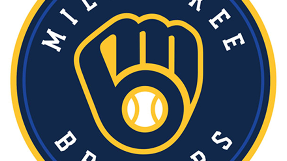
We love a good logo design secret, but it’s not often that we discover one from a game show. At first glance, the Milwaukee Brewers logo looks like a ball in baseball mitt. At second and third glance too. In fact, it turns out that even players on the team took years to notice anything else.
But once it’s been pointed out on the quiz show Jeopardy, it suddenly becomes obvious that the design has a clever secret: it also references the team’s name. We might need to reassess our pick of the best MLB logos because we missed this too!
https://t.co/grUCHPgadT pic.twitter.com/Hmoit4kX0ZJune 9, 2025
As noticed by Fast Company, an episode of NBC’s Jeopardy this week saw host Ken Jennings read the following clue under the category ‘Logo-A-Go-Go’ : “Some players have been on this MLB team for quite some time before noticing that its ball-and-glove logo forms the letters M and B.”
You may like
On the show, contestants have to phrase their answer as a question (yeah, it’s weird). The contestant Ted Nyman answered correctly: “Who are the Milwaukee Brewers?” to win $200.
Many MLB fans will have got the answer right from seeing the logo but will have been flawed by the clue. What M and B?
Back in 2019, the Milwaukee Brewers ran a poll on the team’s Twitter profile asking “how old were you when you realized the glove is also an ‘m’ and a ‘b’?” Some 31.4% of people chose “Far too late in life,” and 29.5% chose “Wait. What?!”
How old were you when you realized the glove is also an “m” and a “b”? #glovestoryNovember 19, 2019
The clever Milwaukee Brewers logo originated in a design from 1978. According to the team’s website, the design was submitted by the then art history student Tom Meindel in a logo contest that drew nearly 2,000 submissions. Meindel won $2,000 and his logo was used for 15 years until 1993 on its first stint. It was later refined and brought back for a 50th anniversary rebrand in 2019 and it’s still in use today.
Daily design news, reviews, how-tos and more, as picked by the editors.
The original ball-in-glove Milwaukee Brewers logo (left) and the current design (right) (Image credit: Milwaukee Brewers logo)
Now, some people are going to say, but it looks like the ‘b’ comes before the ‘m’. True, but I still think it’s a clever logo design. Its enduring popularity is testament to how well it works as an identity, and the fact that it’s still surprising people after 46 years is a bonus.
For more inspiration, see our pick of the best sports logos of all time.
