
Why you can trust Creative Bloq
Our expert reviewers spend hours testing and comparing products and services so you can choose the best for you. Find out more about how we test.
Ever since the first Nothing Phone 1 released with all its exposed internals and glowing Glyph bravado, I’ve thought that design couldn’t last forever. The industry has a way of dulling the edges of newcomers; unique designs get refined, bold ideas get softened, and before you know it, you’re looking at yet another thin rectangle chasing market share and shouting about a new colour change.
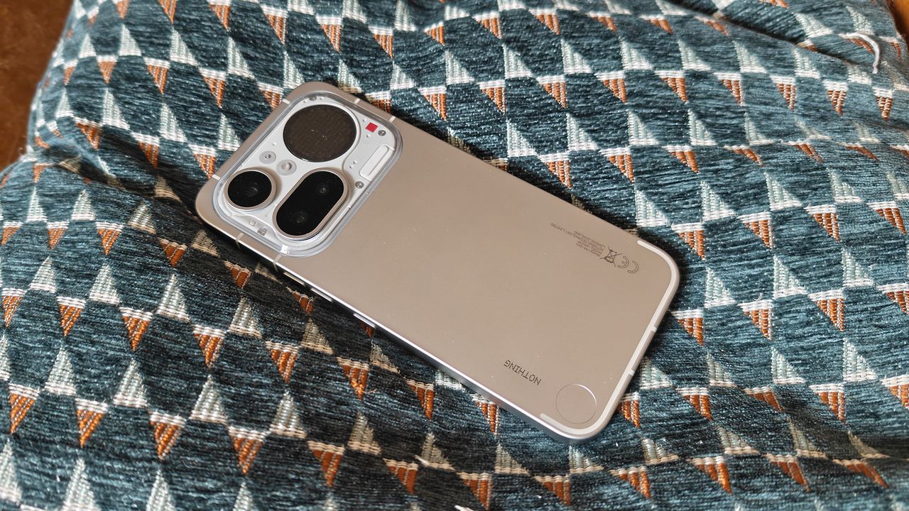
The new Nothing Phone 4(a) Pro – the big brother to the excellent Phone 4(a) – doesn’t do that, completely, thankfully, but it does shift the studio’s rules a bit. This is a different kind of Nothing phone, one with a split personality. Up top, the brand is still letting itself run wild: the camera block and Glyph Matrix lights are packed together with confidence, shunning the typical smartphone camera cluster. There’s a nod to the retro cassette-inspired look of the brilliant Headphone (1), too, which also plays on the brand’s retro DNA.
The design builds on Headphone (1) and clusters the fun into a top casette inspired block, with a traditional smooth aluminium body. (Image credit: Nothing / Future)
Less chaotic but still fun
I’ll admit, however, I do miss the earlier boldness of the Phone (1), with its full transparency, retro-industrial patterning, and LEDs that pinged across the entirety of the phone, which had something to prove, and it did so loudly. It felt scrappy and punk-ish in design, and did the job of putting Nothing on the map – I bought one. The Phone 4(a) Pro is more measured. The use of transparency is dialled back, the Glyph LEDs are replaced by a circular dot-matrix display, and overall, the design is more composed; you can sense that Nothing’s small design team is finding confidence and restraint in how it interprets the brand’s DNA.
By doing so, Phone 4(a) Pro avoids tipping into the sterile minimalism that so many competitors rely on while still retaining the brand’s quirks. There’s still personality here, the same retro inspiration is evident in the camera and Glyph cluster, but its now now more balanced, and in the hand, the cluster lies neatly above my fingers, a perfect design.
The material shift to aluminium plays a big part, too. This phone is slimmer, denser, and better balanced than previous Nothing phones. The Phone 3(a) Pro, for example, could feel a touch top-heavy; now the weight sits nicely in your hand. The aluminium frame adds cohesion, something the earlier designs flirted with but never quite achieved.
The Glyph Matrix illustrates this change and builds on the way Nothing’s flagship, the Phone 3, moved the LEDs from all over the rear to the top of the panel. Gone is the sprawling, anarchic glow and now it’s tighter and more purposeful. Having used it for months on Phone 3, and now on Phone 4(a) Pro, this little display is as much a utility for displaying the time, incoming calls and more, as well as a fun little gimmick, a talking point down the pub.
The Glyph display itself is larger than on Phone 3, so notifications, timers, and small interactive animations and apps are easier to read, making Phone 4(a) Pro arguably more useful than Nothing’s flagship, but you lose a bit of that raw energy that made the older designs so striking.
The Nothing brand remains at the forefront, including the paired back UI and bespoke fonts and retro app design. (Image credit: Nothing / Future)
Nothing’s growing pains
Design changes aside, the Phone 4(a) Pro isn’t trying to muscle its way into flagship territory, even though the design makes it feel as if it belongs there. The Snapdragon 7-series chipset keeps daily use smooth, meaning apps open quickly, animations stay fluid, and the high-refresh OLED display does much of the heavy lifting. I’d say the Phone 4(a) Pro is tuned for consistency and cost, offering solid specs for its mid-range price point rather than raw power.
The cameras follow the same balance of performance and cost, with their multi-lens flexibility offering good wide, ultra-wide, and zoom options that are impressive. In good light, the results are solid; in trickier conditions, it’s a reminder that this isn’t chasing the high-end photography of more costly Samsungs. Overall, it’s good enough, well judged, and not overreaching, in fact, just what you need from a standout mid-range smartphone.
Battery life is solid, too. A full day is comfortable, charging is quick enough, and Nothing OS keeps things clean and bloat-free. In fact, Nothing’s approach to developing its own Essential Space and other bespoke apps means there’s restraint here that results in longer battery life; essentially, it feels focused and useful with just enough flair to stand out in the smartphone crowd.
This is Nothing’s slimmest phone, and its made some clever choices like moving the Essential Space button to one side. (Image credit: Nothing / Future)
A brand finding balance
All of this feeds back into the design as the Nothing 4(a) Pro feels like the brand is testing how far it can stretch toward the mainstream without losing its identity or its reputation for experimentation – pushing for the familiar slim, unified finish while offering hints of transparency and retro inspiration, fun Glyphs, and digital audio ringtones.
I still miss the punk edge of the early devices, the willingness to be awkward, a little messy, in pursuit of something different, like a reimagined piece of tech from the Blade Runner set. But the Phone 4(a) Pro feels more grown-up, more considered, and more aware of the market it lives in; this is a sign the designers at Nothing are confidently learning where to stand out and push the design and when to step back, and yes, it’s very mullet-like in approach, albeit in reverse, but I like it.
Nothing Phone (4a) Pro: Price Comparison