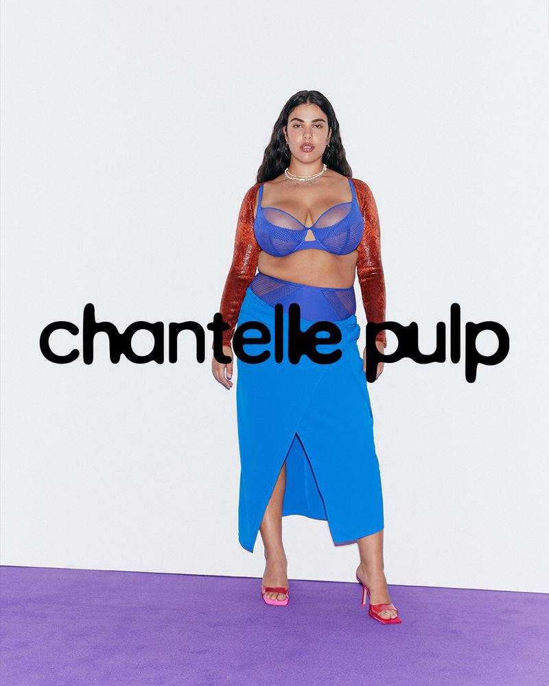
As design briefs go, Chantelle Pulp’s unwavering commitment to inclusivity and individual expression quite naturally lent itself to variable font technology. Monotypes logotype couldn’t just exist in one static state – “ideas of diversity, adaptability, and boundary-pushing were central to the creation of the variable logo from the start,” says Daniel. Collaborative workshops, sketching sessions and exchanges with Chantelle’s global chief creative officer, Renaud Cambuzat, and head of design, Natalia Kotkowska, cemented into the idea for a shapeshifter logo capable of morphing its look through different weights and shapes.
Understanding the brand’s history was essential to the design of this logotype. Like all projects at Monotype, a sensitive understanding of Chantelle’s individual voice became the defining feature of the logo: “letters aren’t just shapes,” Daniel shares “they’re cultural carriers that turn a brand’s voice into something you can see and feel.” That’s why these letterforms were drawn to stretch, expand, and softly greet one another. Their curves look like they’ve been drawn with an ink pen that’s beginning to leak, sweeping away sharp outlines or boundaries and leaving room to evolve.
The logotypes final iteration took a lot of tweaking: decisions on where letters “connected or melted into one another” or how much of the brand name became “distorted, and to what degree” spurred on hundreds of different iterations of the brands name. Despite the roundness it’s found, some early tests of the logotype explored capitals with varying degrees of curves. The team also spent a good deal of time defining a motion behaviour for the font that had the right balance of “fluidity and confidence”, Daniel says, as, whilst the logo is currently taking on a static form in many applications to build recognition, its design will morph into future motion applications, “ensuring the identity remains fresh and relevant over time”, he adds.
Although the new logotype’s fluidity reflects the brand’s commitment to inclusive sizing and styles, the marks was also crafted to offer endless possibilities for customisation in its flexibility, allowing the label to craft new campaigns for each season and “respond to new cultural shifts”, ends Daniel. This adaptability will be the ticket that ensures that Chantelle Pulp “remains dynamic, relevant, and boldly expressive in future”.
