You may or may not have heard of Furl, a British company that designs and makes high-end things to sit/lie on with storage in them – that’s sofa beds, storage beds and storage sofas.
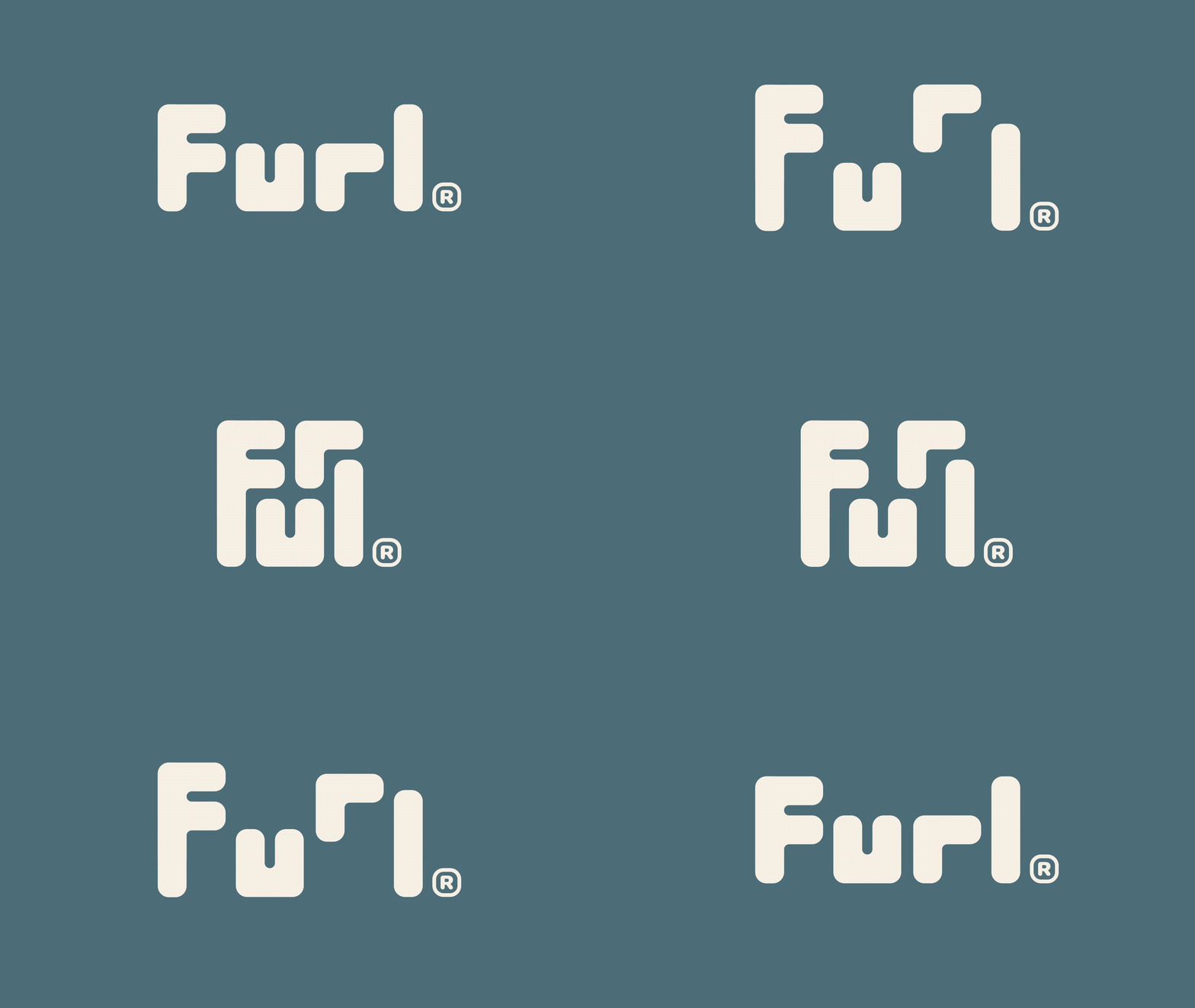
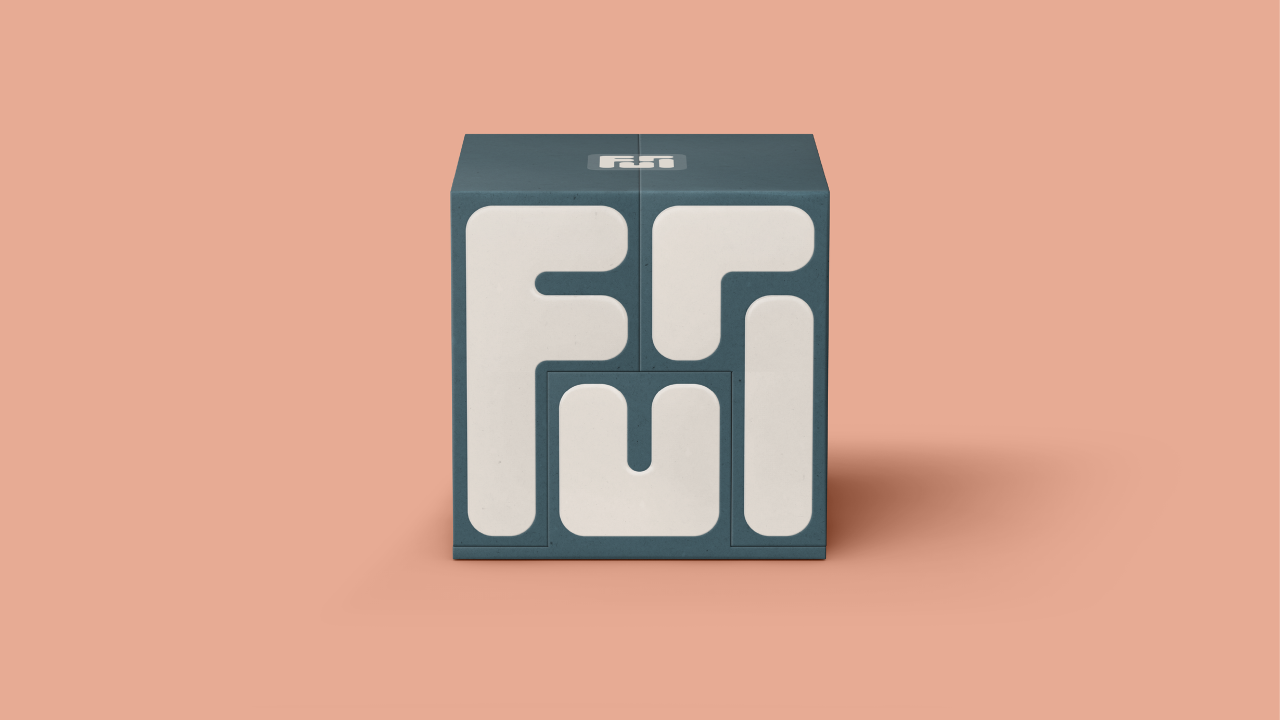
But you’ll be more likely to pay attention if you do come across them as Furl now have a revamped new look by Derek&Eric, complete with a clever logo that folds up as neatly as its sofa beds.
The new identity is based around the idea that a beautiful and well organised home can provide much-needed respite from a chaotic world. And when your home works beautifully, your mind can too.
You may like
(Image credit: Furl)
The new logo unfurls and furls together seamlessly, and is inspired by the transformational nature of Furl’s pieces.
It’s set within a classically refined palette, classic typography, soft patterns and serene yet sun kissed photography, and aims to evoke a feeling of effortless luxury and mindful clarity. I think it achieves this.
The reasoning behind this shift is that consumers are finding it harder and harder to justify buying luxury or high-end items. Furl recognised that they needed to appeal to feelings rather than just function.
(Image credit: Furl)
The previous brand was all about engineering detail and technical benefits, while the new identity is all about feeling calm and considered.
Daily design news, reviews, how-tos and more, as picked by the editors.
“This wasn’t about chasing trends or changing who Furl are,” says Alex Stewart, creative director at Derek&Erik.
“It was about unlocking the emotional value already built into every piece they make. Helping people feel what their furniture has always delivered: more space, more clarity, and more ease.”
“We’ve always focused on craftsmanship and service, but the new identity gives us a clearer way to show people the real-life impact of that,” says David Norman, founder of Furl. “It’s not just about storage or engineering. It’s about creating a space that makes you feel more at home, and Derek&Eric completely got that.”
I think this is a really successful rebrand, and I just love the way the logo transforms. It’s got a hypnotic feel to it.
For more great rebrands, see the best rebrands of 2020s (so far).
