
Distinctive character designs are recognisable from just a quick glimpse of their outline. Why? Because they are built from strong, easily readable shapes. In the article below, concept artist Mariia Bulgakova shares her process for creating dynamic characters that make a big impression in an instant.
If you need to update your art setup for your own work, see our guides to the best digital art software and the best drawing tablets. You might also want to see our general character design tips.
Mariia is a concept artist and illustrator known for her vibrant character designs and environments. She shares her process via Patreon and has over 120,000 fans across her social channels.
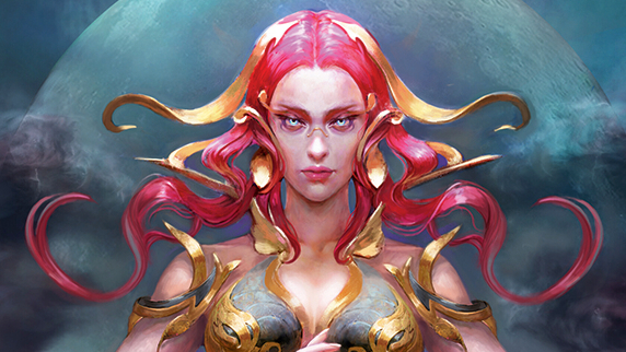
01. Make them memorable
(Image: © Mariia Bulgakova)
Start with simple geometric shapes to make your character recognisable. A strong silhouette makes the design visually impactful. Emphasise the silhouette using negative space such as cutouts in clothing, gaps in armour and so on.
02. Consider shape balance
You may like
03. Apply visual asymmetry
(Image: © Mariia Bulgakova)
Adding subtle asymmetry, such as differing armour details, makes the character feel a little more dynamic and unique.
04. Integrate dynamics into the silhouette
(Image: © Mariia Bulgakova)
Why not incorporate elements that evoke a sense of motion, such as long ribbons, flowing fabrics or windswept hair. By doing this, a character can feel alive even if they’re placed in a static pose.
05. Create associations with the personality
06. Contrast to enhance details
07. Mix warm with cool
(Image: © Mariia Bulgakova)
Complementary colours create a strong focus and evoke an emotional response. For instance, combining golden metallic armour with fabric in cool tones effectively conveys both the atmosphere and harmonious colour schemes.
08. Consider cultural context in colours
09. Textural accents
10. Create depth with accented lights
(Image: © Mariia Bulgakova)
Use lighting to emphasise key details, such as the face or hands. In this example, the face is highlighted with a warm, bright light that brings it into focus and adds atmosphere.