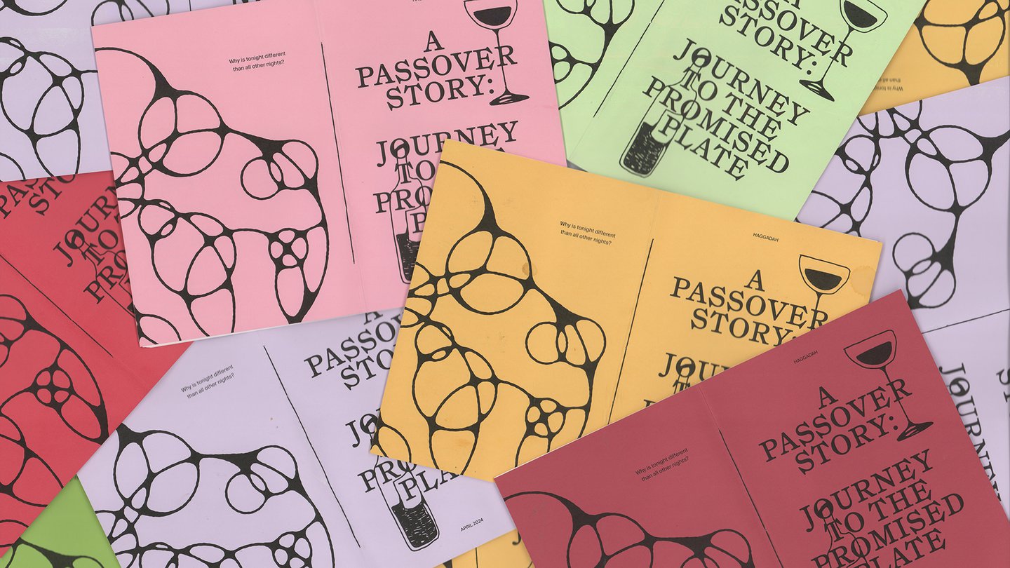
Despite my incredibly Anglo full name and patrilineal line, I am – at least according to Jewish law, which assigns Jewish-ness matrilineally – 100% Jewish. And though most gentiles (that is, non-Jews) know about Hannukah due to its inclusion in the broader “Holiday Season”, far fewer are familiar with what I consider to be the best Jewish holiday: Passover. For those not yet in the know, Passover is one of the most widely observed holidays in the Jewish calendar, and takes place every spring, typically landing around the same time as Easter. If you’ve seen The Prince of Egypt, you more or less know the story: Moses, Pharaoh, plagues (blood rain, frogs, locusts, etc.), a split sea, and eventual liberation from slavery in Egypt. The associated ritual dinner, called a Seder, follows a highly ordered structure, and uses a religious text called the Haggadah to guide participants through storytelling, music, symbolic foods, and more.
Growing up, Passover always meant Florida. Every year, we’d fly down to Boca Raton, the capital of septuagenarian Jews, for Seder at my great-aunt Elaine’s house. While she and my grandmother kibbitzed over matzo ball soup, my cousins and I would screw around on a nearby golf course as my aunts and uncles snuck sips from “Prophet Elijah’s” glass of wine. The Haggadah we used for our Seder was informal, to say the least. Photocopied from the prominent Maxwell House Haggadah (originally created as a marketing promotion for the Maxwell House Coffee Company in 1932, with over 50 million copies produced since) it had been re-printed so many times it was barely legible. Though the original Maxwell House text is one of the most widely used, the yearly edits were unmistakably ours. Passages that were deemed “too long” were crossed out, and the margins were jotted with notes from past years. All serve as evidence of the Haggadah as an evolving document shaped as much by commentary as by content.
In 2020, like many others, we hosted Passover online. The logistics were awkward; it’s hard to simultaneously dip your pinky in wine and click the unmute button. We also used a new Haggadah – one that felt decidedly contemporary. Designed by Dani Balenson specifically for digital Seders, it was grounded in ritual structure while still tailored to the practical realities of the moment (that is, narrow enough to sit alongside a Zoom window). It used contemporary typefaces and stylish gradients, and had a tone of voice that balanced thoughtful commentary with just enough cringey puns to keep things lively. My family loved it. So did I. At some point, I realised why. A Haggadah is really just a zine – self-published, idiosyncratic, and community-driven. And I love zines! It left me curious: how had others approached the document? And what does it mean to redesign something that’s never really been finished in the first place?
