
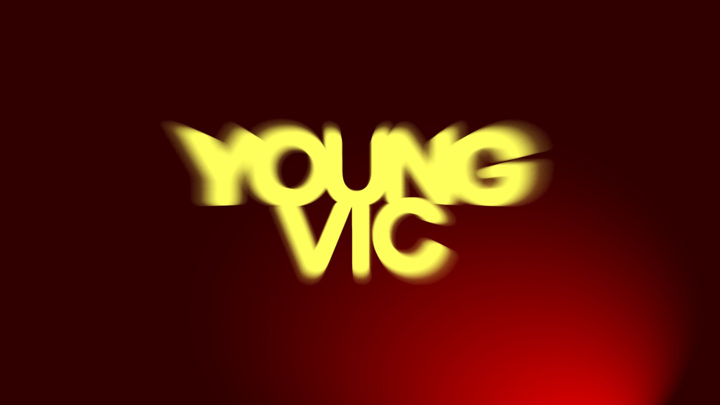
How do you design youth? Traditionally, the youth is seen as trendy, modern, in front of the curve. For venturethree, the advertising agency behind the Young Vic’s newest identity, youth signifies vitality, a restlessness, forward momentum. In previous identities, the Young Vic, a self-described “disobedient theatre” was characterised by a graffiti-stencil look, communicating a suburban teenagery feel, but it felt a little dated. The identity needed mobility, so venturethree gave it legs.
The new logo is hand-created rather than set in an existing typeface, but designed to echo Modern Gothic by AllCapsType, the primary typeface used across the identity system – and it looks like you’re heading right towards it through a forwards motion blur that prompts viewers to lean on the edge of their seat. “The two [the logo and Modern Gothic] speak to each other without being identical, which gives the system coherence while offsetting the handmade, imperfect quality that makes the logo feel distinct,” says Regine Stefan-Aboud, creative lead at venturethree. Within this visual overhaul, an aliveness is key, shifting in intensity depending on context and application. “It feels young by being energetic and a little unresolved,” says creative lead Laura Oakden. On tickets, it gives a lovely, inviting glow. On paper, it becomes impressively dusty, like the Young Vic has burned itself in. And when the logo turns white, it’s like a portal has opened up.