To craft a letterset that did both – and in doing so sits as both a tool for display and body text – Thierry and the team at Grilli meticulously studied the curves of these older lettersets and whittled away at any letterforms that “were too awkward” to be transformed into successful text styles. Whilst some quirks like tiny apeture’s were streamlined for body sized copy, the typeface finds its expression in its bolder weights, “that have more of that charm”, the designer shares. As GT Era scales up it introduces “very wide capital letters, raised middle bars in F, E, H, and so on – details that can easily be reversed for text styles, like the strong contrast in diagonal shapes and the sharp stroke terminal corners”, Thierry says.
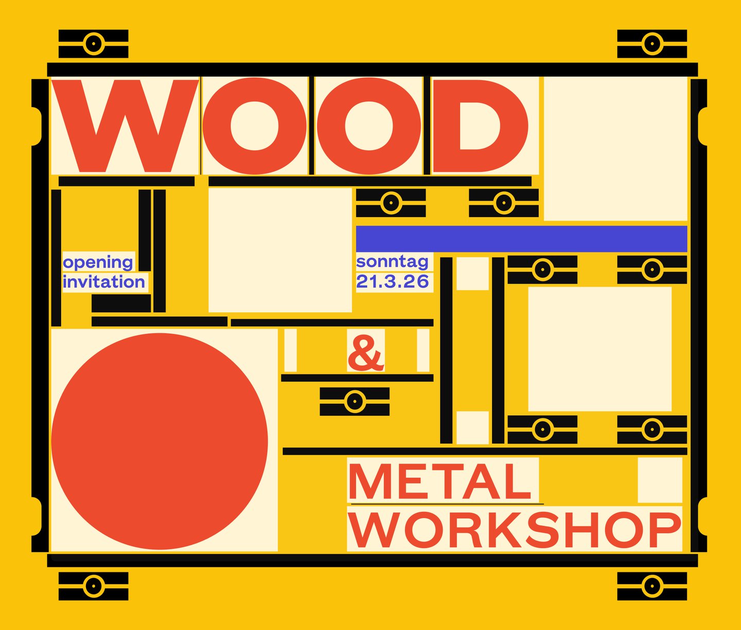
The typefaces release came with a beautifully designed, primary coloured launch website that shows off all corners of the letterset in true Grilli Type Style; it’s a great tool to see how a typeface, inspired by the days of wood and metal type, sits in the digital world. “We often still rework our typefaces during the sites design phase because we learn so much about what works and what doesn’t work perfectly just yet,” Thierry says, as was the case with GT Era. “In the end I’m a graphic designer and the typefaces I make should be eminently useful to my colleagues, but also provide something that hasn’t yet been expressed in the world of type,” the designer adds. “That’s always the hardest part but I’m happy with how GT Era fits into that scheme.”
At first an obsession with those original early grotesks, GT Era slowly developed into “a reaction to the terribly bland branding we’re surrounded by everyday”, that has become so synonymous with the modernist sans serif, Thierry states. “With an explosion of more expressive but kind of same-same looking brands in many categories, GT Era questions how a typeface could counter that by being a tool for both expression as well as just being a really useful tool for typesetting across all font sizes,” he ends. The typeface unpicks these traditional forms for both small and large scales to create a new kind of imperfect minimalism that challenges the systemised sans. Who knows, it might be time to ditch your ‘evenly balanced typeface for something with more friction and flavour’ and enter your GT Era.
