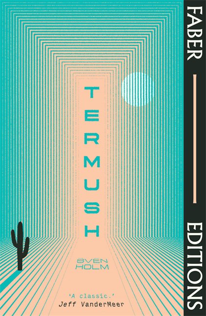
Upon reflecting on the original Faber Paper Covered Editions, Pete identified some strengths. Those he saw as “most successful” had a “bold typographic and/or illustrative treatment” which in turn “countered the dominance” of the branding strip that ran down the side. “This realisation led me to define some rules for the designs of the individual covers that tried to ensure that the covers would never feel overwhelmed by the branding system,” says Pete. “The core rule was that the Editions would essentially be typographic covers, or typographically-led covers in terms of the hierarchy between type and image.” To complement this rule, the illustrative element would always be the second dominant feature and the palette limited to an off black and off white (which Pete then set CMYK breakdowns for) so the designer had the choice of two colours, which could be used in varying tones. Finally, the branding strip would contrast to the main colour of the cover, using one of the four predetermined colours.
Another all encompassing ethos that Pete wanted to inject into the series was “a sense of craft” or, at the least “evidence of the human hand”. The art director identifies Faber art director Berthold Wolpe – who was working at the mid-point of the 20th century – as a key influence. Many of his works featured hand-drawn lettering which, in Pete’s words, had, “the effect of pulling the whole jacket together and making everything feel like a piece”. A brilliant example of this translating into the modern series is the cover for Rachel Ingalls’ 1982 Mrs Caliban, one of the first titles Pete designed for the series; its soft, sweeping lettering looks as if it’s been free-handed with a paintbrush dipped in fresh paint. “I really liked how the fluidity of the design reacted to the rigid branding bar without seeming out of place,” adds Pete.
There’s one moment Pete pinpoints in being integral to both his own creative development and that of the Faber Editions series, interning at Penguin in 2009 and encountering the work of David Pearson. “[I] remember seeing his Penguin Great Ideas series in the office and being completely mesmerised,” says Pete. “Every title looked completely unique and really purely reflected the personality of the book, but because of the simplicity of the overall series design they hung together with ease. This was a great lesson for allowing disparate designs to work together as a unit.” He adds: “I also loved the choice of finish, uncoated stock with a simple deboss on the key features and I adopted exactly this for the Editions so they have a tactility.”
