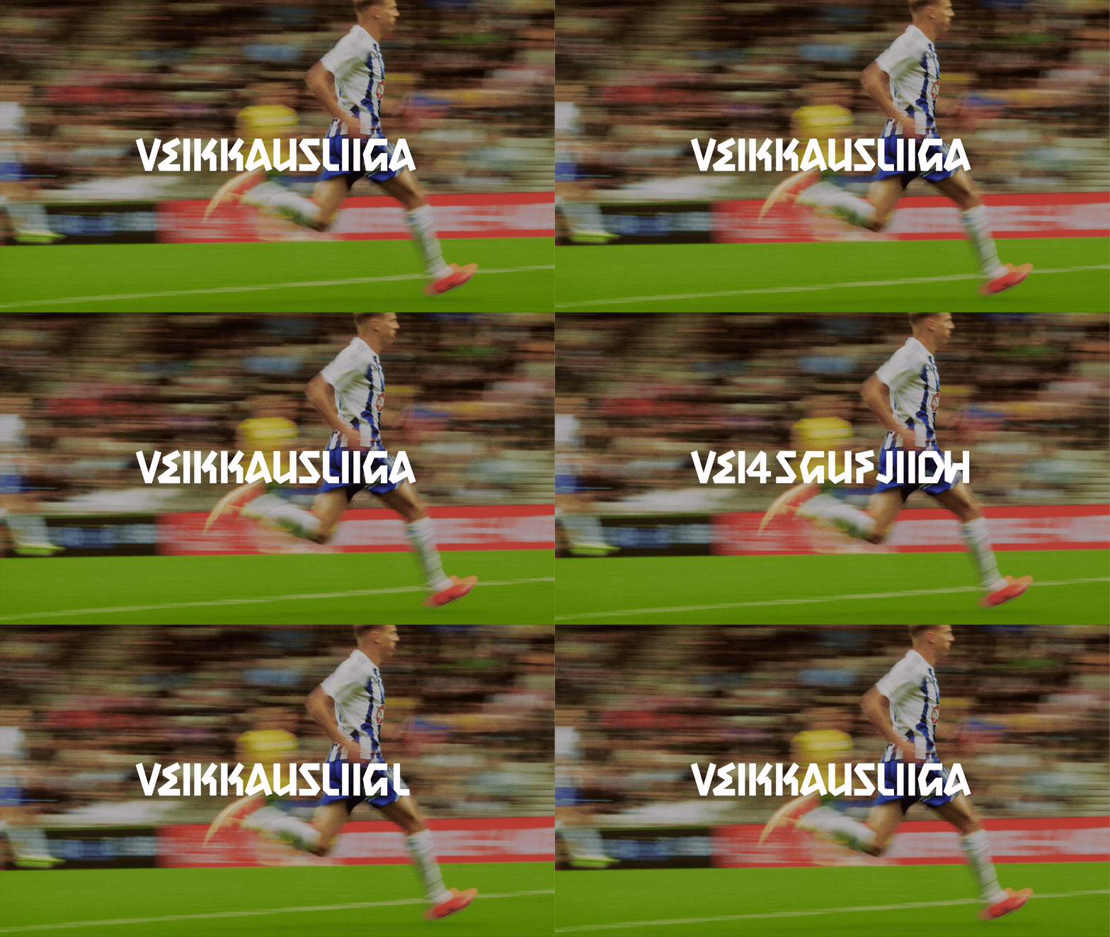
The bespoke typeface, Scarf Gothic, is playfully boxy and cornersome in its construction, finding a distinctive intersection between rigidity and candour. Its initial design came from Bond’s exploration of how one could fold a scarf to creative letterforms. “From there, we started sketching multiple versions of each character,” Jesper recalls. “One challenge in developing Scarf Gothic was ensuring it remained legible while still maintaining its unique character,” he says, needing it to truly stand out and not simply blend into the crowd. Working with type designer Teo Tuominen, the aim was the create a sense of harmony. “The typeface had to work alongside the abstract logo and other geometric, bold design elements, and that required careful balance,” Jesper adds.
The studious balance of form and flair at the heart of Veikkausliiga’s brand is also forged by Bond’s approach to pattern and colour – a distinctive supporting element to the identity introduced to reflect football’s emotional spectrum. “They were designed to visually capture the emotional highs and lows fans experience throughout the season,” Jesper says, whilst also adapting to each of the club’s own colours, creating a personal connection between fan, team and league. As a result, the identity achieves what it set out to do, bringing the sport together and celebrating those within it without leaning into nostalgia, cementing a profoundly forward-thinking identity. “The goal wasn’t to get stuck in the past, but to create something relevant to younger, digitally savvy fans,” Jesper ends, “because of this flexible and emotional foundation, the brand can evolve along with the league and its audiences.”
