Its typeface, Affinity serif, was made in collaboration with Ohno, a bespoke adaptation of its typeface Swear, and comes in six weights. “When used light and small, it’s super precise and premium; in its big, fat, expressive italic form, it looks more bold and a bit weird,” Tom explains.
Overall the tone of voice is packed with wit and in-jokes, from its copywriting down to its new file name, .af – which apart from being on every file you export from the programme, is also used in myriad, tongue-in-cheek ways across merch, such as its “Sketchy.af” notebook.
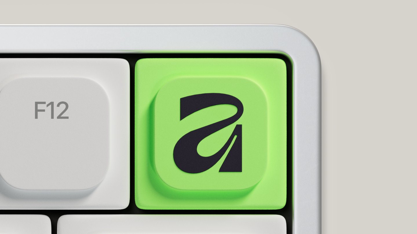
The colour scheme is a nice touch as well: rather than straightforward monochrome, its palette includes charcoal, graphite, putty, paper – tactile, material-based colours inspired by artists, with a lime green colour for a “punch of punk”. This also acts as a helpfully muted backdrop to all the very vibrant original artwork Affinity has commissioned for the product, letting creative work take the limelight (as per its ethos). Across the rebrand you can also spot the brand’s six ‘ethos tags’, created by Made By James.
The rebrand was done with a panel of design professionals and an advisory board featuring the likes of Debbie Millman, Eddie Opara and Lisa Smith. With so many opinions chiming in and considerations for the brand’s new identity, Tom says his approach was to get two prototypes “down on paper” as early in the process as possible, one that was distinctly Affinity and one that was like a pro version of Canva. “Rather than people debating words on a page, like ‘it should be 70 per cent Canva or 30 per cent Canva’, I wanted to share designs early, show what that would look like, because as soon as people see stuff, they change their minds. It was a really informative exercise.”
The final design system is modular and adaptive, a toolkit that Tom likens to jazz – with design elements acting as instruments to be played. Learning from his past experience, he and his team were aiming to create a strong brand DNA with emotional intelligence that can flex and change tone according to audiences, from a typographer to an illustrator. Also, one that can sit alongside Canva, as its refined sibling, who has recently come out of their shell.
