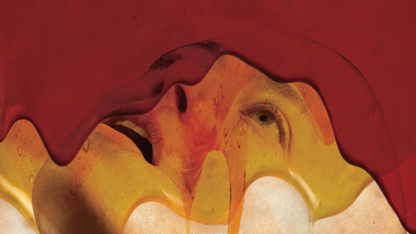
In Bugonia, Vasilis consciously restricts superfluous elements and allows the frames to breathe. Before working on any draft, the studios send him tens of thousands of film stills. Then the cutting begins: Emma Stone’s ears from one image might be joined with her face from another. It all needs to fit just right without appearing overly precise or neat. With Bugonia, Vasilis has also worked on the title design for the credits, and already the use of a strange geometric type, seemingly brutalist, has defined the film’s visual language: Churchward Roundsquare, created by the Samoan-born graphic designer Joseph Churchward, who passed away in 2013.
“I was looking at his fonts and remembered this very sharp one. I found the archetype of it at the Museum of New Zealand, so I asked if we could digitise it,” he says. “They told us to speak with his daughter, and she permitted us. I love this font because it feels monumental yet sharp, even a little threatening. It struck me as futuristic, but in a very analogue way, which is, in a sense, exactly what the film itself is.”
All the type Vasilis works with, including Churchward Roundsquare, is created by hand. He first prints the letters, then splashes water onto the wet ink to create a subtle smudging effect. After scanning the results, he digitises them. In the film’s credits, he explains, only the middle letter is set in Churchward Roundsquare; the rest is in Adobe Garamond. With multiple names stacked in the end credits, the large blocks of Churchward, when read vertically, almost form a gibberish word of their own. That was a conscious choice.
“I don’t like things looking too sharp. I don’t really know how to use Photoshop, so for me, the easiest way was just to water it down – literally put water on the letters with a brush.” But there will always be different versions until he gets the right one. “For example, in the credits, if there is a name like Emma Stone, I might do six different ‘waterings’, because you never know which one will work. Sometimes it gets too messy. So, with me, all the typography is really DIY.”
