
It’s hard enough to please the general public with a new logo, but impressing sports fans is a whole other battle, as evidenced by the heated response to Texas Tech’s new logo. Unveiling a collection of new logos and emblems, the university claims its new look is simply the work of modernisation, while some fans think it’s a disappointing downgrade.
The best sports logos often tap into heritage, which in turn leads to fans getting attached to a classic design. While it’s great to unite supporters with a simple design, it’s a double-edged sword, as some fans can be resistant to change, making logo evolution a delicate task.
As part of our future brand identity, the iconic Double T not only gets a modern twist that features proportional design elements, but updated colorway options for maximum versatility. pic.twitter.com/4KKcdSr4pjOctober 7, 2025
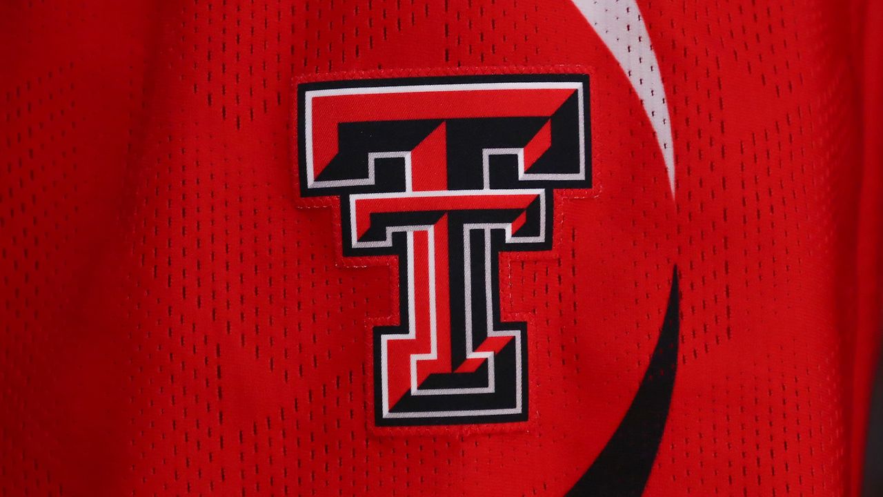
A stripped-back rendition of its 3D varsity style logo, the new Texas Tech logo features two overlapping ‘Ts’, depicted in a powerful red. The new logo features a flat design in a red, white and black colour palette, expanding the identity while simplifying the classic design.
You may like
“As part of our future brand identity, the iconic Double T not only gets a modern twist that features proportional design elements, but updated colorway options for maximum versatility,” the university explained via X.
(Image credit: Texas Tech)
Despite its explanation, fans were unconvinced by the “modern twist”, with many feeling the design had been oversimplified. “The new logo looks dull & naked, like it got stripped of its personality,” a fan on X wrote. “That logo is like buying a base model Sedan with no window tint and no power windows,” another chimed in, while one fan claimed it was “Worse than the Cracker Barrel rebrand.”
Given the backlash over their new logo, I have designed a new one for Texas Tech that nobody can possibly complain about. You’re welcome Tech. pic.twitter.com/h9YD1Mm26wOctober 8, 2025
For more logo news, check out how this “essentially identical” logo reignited a 40-year brand war or put your skills to the test with this NFL logo quiz.