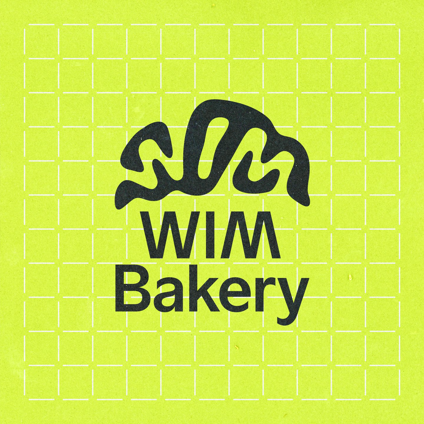
Once the tile-like grid systems were set up, Kevin introduced printed elements to the identity, taking influence from the flour on bakers benches that stop dough sticking to surfaces. Creating a halftone image treatment for assets, the designer transformed Wims tasty images of baked goods into a set of “grainy textures that evoke the look of flour scattered on a surface”, he says. For the typographic elements that overlay these images on bakery signs, menus, coasters and posters, Kevin used a custom typeface MM Sign, developed in collaboration with Daniel Wenzel at Mockup.Maison. “Its clean, neutral letterforms provided a strong foundation for adding more expressive graphic elements”, Kevin adds.
The imagery wasn’t the only thing that has ties to the kitchen; the brand’s new logo neatly fits into the curved shape of a croissant. “People really seem to enjoy the croissant logo”, Kevin says, but he assures us, although it looks “straightforward”, this typographic solution actually took dozens of explorations and sketches to get right. From the very beginning of the project the designer was intrigued by “the symmetry in the word Wim”, and knew he wanted to do something with this visual trick. Although he wasn’t initially expecting an arrangement of letters that naturally formed a croissant, it’s now become a playful visual reference that’s become closely associated with the brand.
Now the ovens are up and running at Wim, the bakery has opened to much local fanfare and the designer often sees people around Zurich sporting the brand’s merchandise, shirts and tote bags that he designed for customers to get their hands on alongside baked goods. “It’s always fulfilling to see people wear your designs in everyday life”, he ends. “It shows that the merchandise is more than just a logo on a shirt; it’s a thoughtfully integrated part of the brand identity.”
