To really bring Stefan’s letters to life, the designers paid close attention to the artist’s tool of choice – a Pentel MLJ20 pen. They analysed the thickness of the nib, recreating it exactly so the stroke weight of the font really encapsulates the charming, wobbly lines of Stefan’s hand. “I’ve definitely never given a single pen so much attention before this one,” Johannes adds. This dedication to the real-world appeal of the font extends into the form of each letter, and rather than getting rid of the “inconsistencies”, they’ve been embraced. Much like a wholly digital font might include variations, Stefan wrote four versions of each letter, as well as punctuation, symbols and numbers. A specially developed randomiser function then lets you type a variation randomly, adding that extra little sprinkle of unpredictable irregularity.
When Stefan sent over his letter samples to Dinamo, one thing really stood out to them: the crossings out. Stefan had crossed out the letters he didn’t like. But – instead of doing as the line indicates, and getting rid of them – the team turned them into a ‘mistake feature’ which lets you digitally cross out text. Another favourite feature of Johannes is the swashes, which can be toggled onto the start, middle or end of the word. “If you apply them to an entire block of text, and by that I mean: everything, it escalates quickly!” he says.
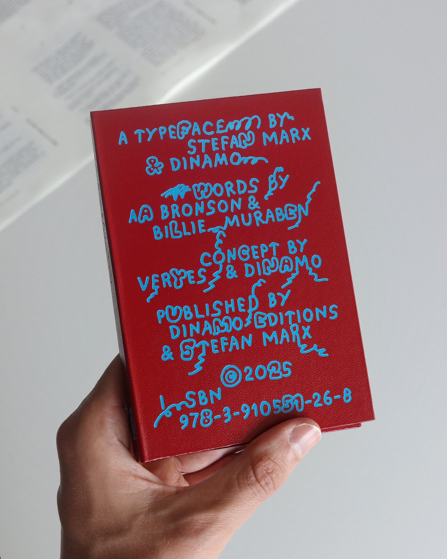
In typical Dinamo fashion, it seems as much consideration has gone into the presentation of the designs as the font itself. Inspired by Stefan’s love of fanzines and Dinamo’s dedication to the physical type specimen, the “artist-specimen-accordion-book hybrid” is exactly what is says on the tin. It’s a book that unfolds like an accordion to reveal all of the glyphs, an A-Z of drawings from Stefan, an essay by the designer, writer and curator Billie Muraben, and a poem-artwork by AA Bronson, the “grandfather of zine-making”, in Johannes’ words. The unique format of the book is not only a fun quirk, it’s a necessity. “ABC Stefan has over 3,500 drawn characters, and honestly, the only way to deal with the trauma of drawing them all by hand was to lay them out across a 2.5-metre-long, endlessly folding sheet of paper,” says Johannes. Finished with a deep maroon cover embossed with cornflower blue lettering, the book is a beautiful keepsake that (when all 2.5 metres have been folded up) will fit snugly in your pocket.
