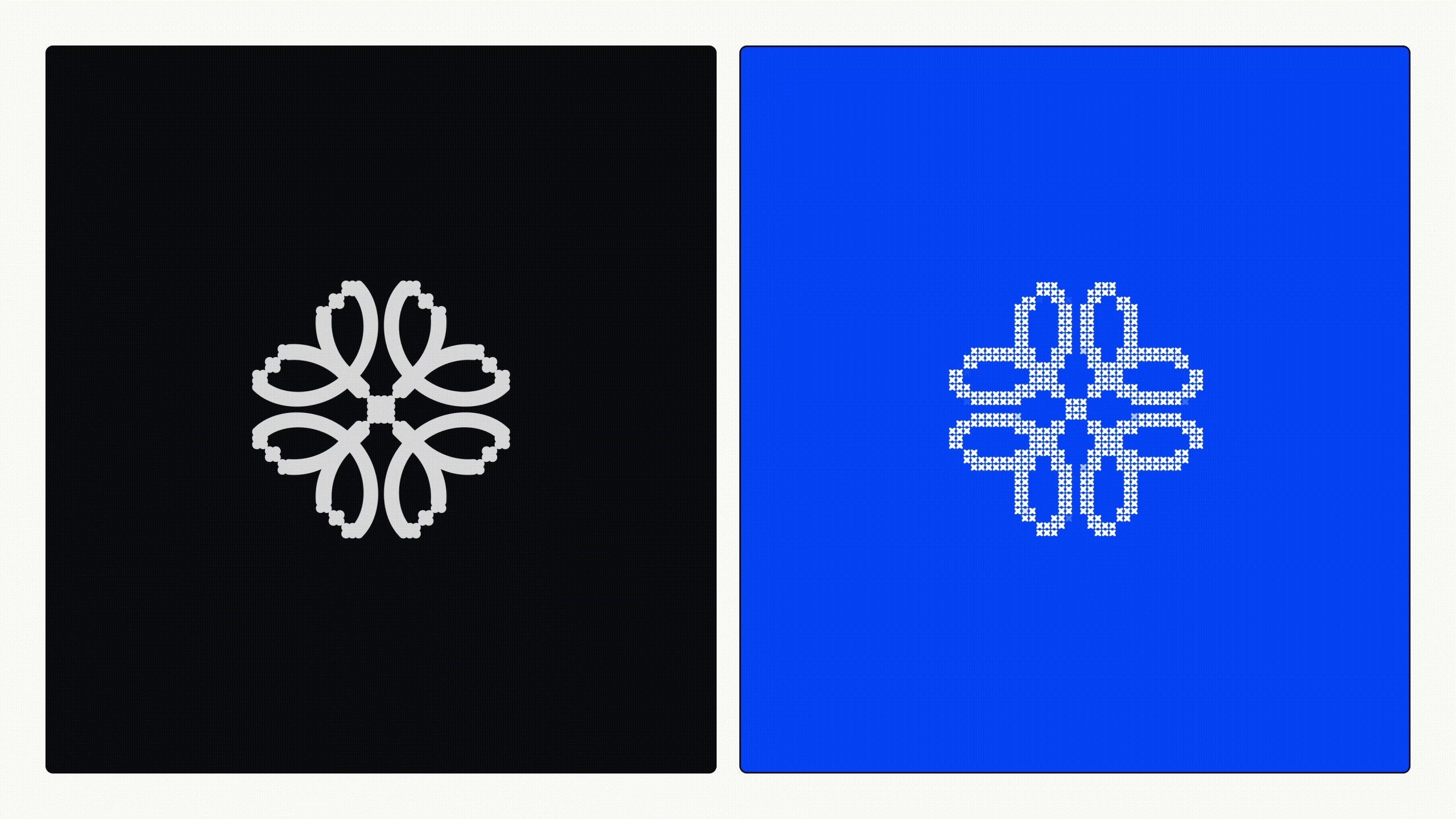
Koto has provided a new brand identity for Uniqode, a QR code management platform that allows businesses to create and track QR codes through real-time analytics. The identity in question hinges on an interplay of the physical and digital, reflecting the usage of a QR code through a cross-stitch visuals. Koto NYC’s executive creative director Arthur Foliard says: “We treat every QR scan like a needle dive: you pierce the surface, slip into a digital layer, then pop back out, threading two realities together in one fluid motion.” He continues: “Showing that ‘stitch’ instantly explains the connection the tech enables without a word, and adds a crafted, human warmth most QR brands lack.”
This visual metaphor manifests in a distinctive, kinetic aesthetic world where digital, ASCII-esc illustrations, patterns and typography make imperfect analogue stitches. Beyond serving an ornamental role, however, the brand’s cross-stitch patterns harbour a far more functional service too. “It’s the master grid for layouts, icons, even motion paths,” Arthur says, “so every touchpoint visually echoes that same connective thread.” This reinforces the strategic narrative of the brand in every instance, all the while championing a satisfying analogy.
