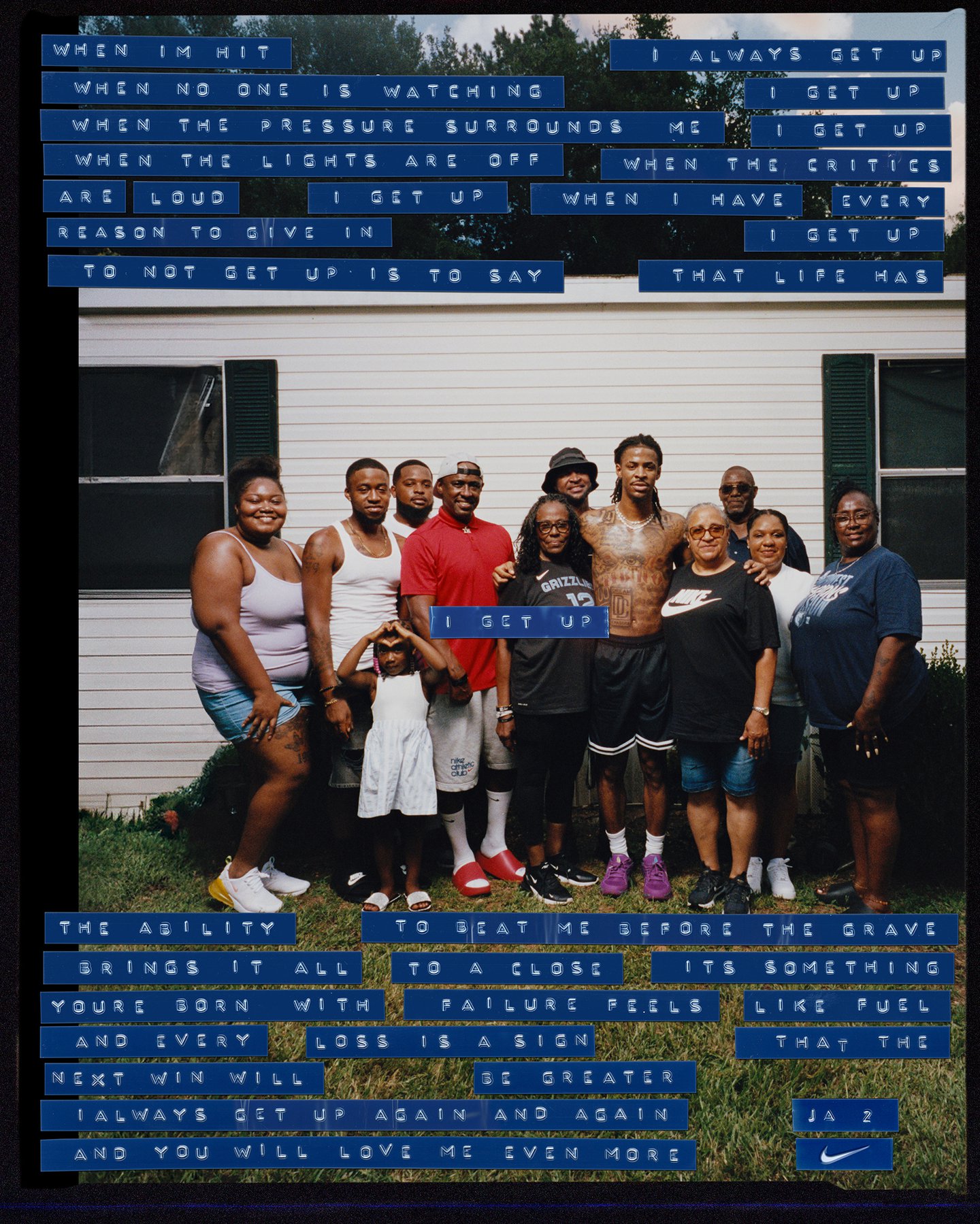
But for a fast paced athlete things couldn’t become too “cutesy”, Carl-Emil says. The grit and intensity of the sport also needed to be communicated in the campaign. So they landed on punched type, often used for labels it has a stark but soft vintage feel. This allowed them to create an identity that was distinct but didn’t take too much away from the campaign’s main event: the imagery.
The studio’s graphic letters sit atop raw and gloriously grainy images from the NBA players archive of family photos: moments playing with family members and friends in his childhood home, contrasted with composite images of him mid dunk. These elements came together to create collages that have the air of old film strips cut together – their imperfections and light leaks merging to create dynamic compositions. The tagline ‘Get Up’, is a reference to both “Ja’s insane jumping abilities as one of the best dunkers in the league” but also a message about his past and his ability to “overcome adversity,” says Carl-Emil.
The project isn’t Astrae’s first venture into the world of sports, or even basketball. Their Chateau typeface, was used by LeBron and Savannah James for their collaboration on a limited edition honey, and the studio have recently embarked on a streetwear brand offshoot Astrae Sports, which takes an aesthetic view on the world of basketball.
This crossover of design and basketball has come up quite naturally for Carl-Emil across his career. Being a fan and a player, “I’ve always viewed the game through an aesthetic lens,” he says. “The culture around basketball is just as interesting to me as the game itself, it has strong ties to music, fashion, film, and art, and with Astrae Sports I wanted to create a brand that focuses on the intersection between sport and culture.” As for the Ja campaign, the designer hopes that the studio’s analogue approach will “resonate with and inspire” fellow fans of the sport.
