
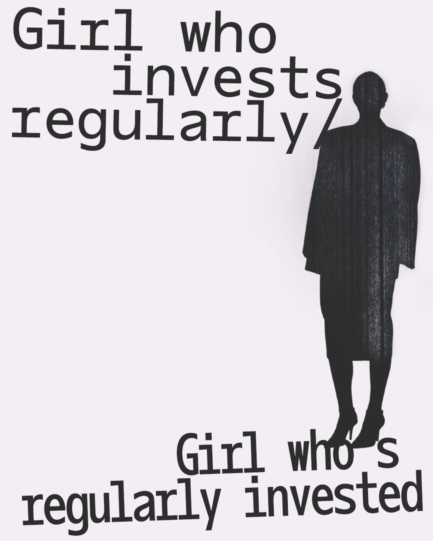
“I made one of my early grotesks into a mono that I had expanded because I liked where it was going, and it became one weight (light), which ended up being available on Solitype, but after the fundraiser was over, it went into the drawer again,” Charlotte says. Last year the designer pulled the project out of the archive again and moulded it into something else entirely, birthing Oficía Mono – a letterset and a woman in her own right – an office siren with a corporate world of her own. “She’s professional, but also cute and girly – she has the heart-dotted i’s.”
The typeface has also recently been given an after-work life with the bold new release of Oficía Poly. Stylistically, the project was informed by two existing typefaces: Antique Olive and Gill Sans. “Gill Sans Ultra Black is such a fun typeface, especially the moment with the i’s, but Eric Gill himself is a highly problematic character (if you don’t know, go to his Wikipedia page),” Charlotte says. “So I wanted to create a typeface that fills the need for Gill Sans – to overwrite that very problematic man by my female hand.”
When Oficía Mono was set to be released, Charlotte teamed up with designer Tina Lehmkuhl with the vague idea of producing some kind of specimen for the typeface to demonstrate how Oficía looks and behaves. “But by then, Oficía already felt like much more than a typeface. She had become a character,” Charlotte says. “I’ve been working for a while with my artistic persona, Charlotte Rohde™ – a ‘good woman’ who constantly negotiates professionalism, agreeableness and female-coded emotionality in the workplace,” the designer explains. “Giving my typefaces personalities is part of that practice.”