
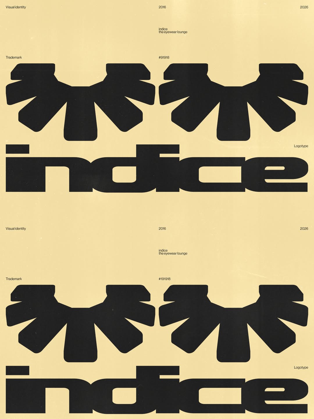
By renaming the brand’s location as The Eyewear Lounge, the agency positioned Indice away from the conventional, sterile or even medical language that traditionally surrounds eyewear or luxury, which then allowed it to step into a new visual world. Tying it to a slow space in the home suggested “time, intimacy and conversation” a place whose collection displays a “deep knowledge of materials, craftsmanship and production”, says Camilla, sitting away from the regular rush of retail. This approach naturally led Adoratorio to draw from the soft interiors that define the inside of the store for a new visual language. That’s why the new logo takes from the very sofa you sit on when picking out your new frames, designed by De Sede – it also coincidentally looks like an eyelash.
“The logotype reflects the store’s sensual, sophisticated curves. The letterforms merge and flow into one another, creating a distinctive silhouette that prioritises feeling and personality over immediate legibility. Rather than simply spelling out a name, the logo was designed to evoke softness, movement and a certain visual seduction,” Camilla tells us. The colour palette for the visual system also draws directly from the interior from the soft butter yellow of the walls to the metallic grey of the stores shelves and panels.
Technical and restrained, this new face for Indice doesn’t push a singular graphic stamp but combines this abstract logo shape with bold condensed typography, pastel colours and photos with the soft grain of film to convey the same welcoming allure that defines an in person browse. “Together, these elements create a visual identity that feels like a natural extension of the store rather than something applied to it,” Camilla ends.