
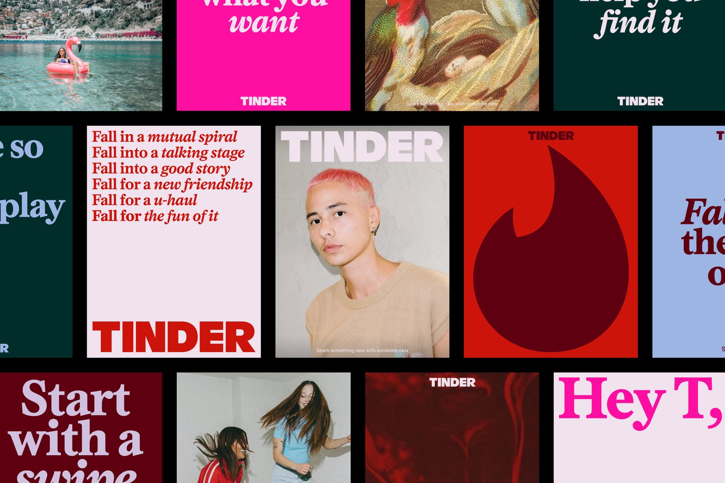
Elizabeth Goodspeed: As a writer, I appreciated that such a good chunk of the rebrand is focused on voice and language (especially nice when you have such a good headline typeface!) Can you tell me more about how that verbal identity was shaped?
Natalee Ranii-Dropcho: We really wanted to make the voice a huge part of the identity. We imagined our voice as a kind of trusted dating columnist. We looked at a lot of really interesting inspirations – the Dear Karen dating column, which ran in UK Sky Magazine in the 90s. And, Carrie Bradshaw. I think both of these columnists have the ability to switch from humour to honesty while navigating the disparate landscape of dating, and hold it all with a sense of care and respect.
We wanted to make the voice feel like it had the experience, but was also living alongside you. This voice has made her mistakes, she’s learned with you, and she’s also having the time of her life doing it. So, we created a fictional persona of ‘T’, who is our dating columnist. It lets us re-imagine that cultural savvy and a sharp wit, but paired with empathy. Someone who’s been there, done that, and can give you advice – now that she’s on the other side.
Yedo Han: It’s funny, because Tinder was one of the first, if not the first, dating apps, so it kind of is the wise older sister of the category. But there’s been such a shift in the number and purpose of dating apps in culture since Tinder first launched in 2012. How do you approach making the identity feel surprising to a new generation, while still feeling like itself?
N R-D: Tinder is the original challenger in many ways, so there was a lot of equity that we had to work with – it’s really bold and iconic and really recognisable. We wanted to champion that and hear that, but give it a fresh look and feel and voice. A big part of this was reclaiming what Tinder is for Gen Z, particularly Gen Z women – for us it’s a fun, often playful way of connecting and meeting people.
YH: In terms of specifics, we updated the shape of the flame so that it feels a bit more sleek and a bit sharper compared to the previous version. It needed to match the daringness and the wittiness that we want to bring into the brand without losing the warmth and the approachability of the existing flame.
Previously the Tinder wordmark was a lowercase sans serif, and we’ve updated that to all caps. It really balances out the softer side of the brand now, especially with the updated colour and the serif we’re bringing in. Because we updated the wordmark to be all caps, that headline serif brings in boldness and confidence, and a little bit of edge. It feels a little bit more declarative of how Tinder is now, this new force reclaiming the dating scene.
The colour palette was interesting because it was a pretty big jump from the previous palette. It’s in the same spectrum – warm red to orange to pink – but some of the gradients and colours didn’t have a clear purpose previously in terms of when and how they should be used. This time, we tried to balance some of the red hues with hues of blue and green, so it speaks to a wider spectrum of the emotions you feel throughout using the app.