
To celebrate the countdown to Spider-Man: Brand New Day, fans have been blessed with a flurry of posters, giving a sneak peek at what’s to come. The latest design finally gives us a look at unmasked leading man Tom Holland (or the bottom half of his face, at least), and while many were swept up in the hype, others couldn’t ignore one tiny detail. There’s something up with the new Spider-Man logo design.
Or at least that’s what some pernickety fans are claiming thanks to the logo’s finer details. With a plethora of Spider-Man logos spanning the movies and comics, any new design has a lot to contend with, so it’s understandable that fans are so opinionated. But who knew a couple of lines could be so controversial?
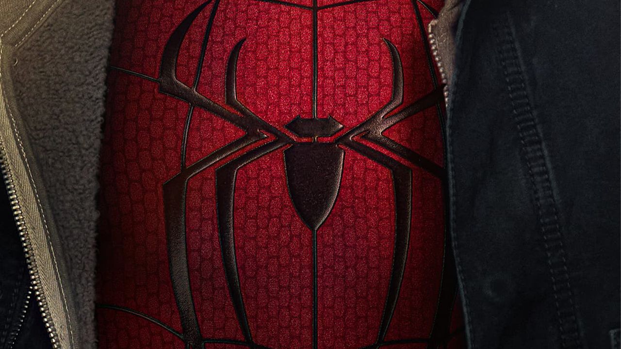
(Image credit: Marvel)
The logo criticism was aired by a disgruntled X user who wrote, “I don’t like how the top legs connect to each other,” in response to the new logo’s debut on Tom Holland’s new spidey-suit. While past iterations of the logo have featured particularly defined legs, the new look’s condensed design has sparked a divide among fans.
Latest Videos From
You may like
I don’t like how the top legs connect to eachother pic.twitter.com/oBjOW5AYY4May 14, 2026
“It’s not intentional logo design, it’s just the web running behind the logo,” one fan tried to explain, only for the original poster to respond, “Oh I see it now, thanks. But honestly I feel like that makes it even weirder?” Others were equally as disappointed in the new look, with one calling it “over designed,” while another added, “As a Graphic Designer I agree, has to be a reason!”
For more Spider-Man news, check out why the Brand New Day trailer launch was genius or test your skills with our superhero logo quiz.