CNBC has a new look, and now we know the reasoning behind it.
On Saturday, December 13, CNBC—like its sister cable news channel MS NOW—dropped the Peacock branding from its logo as part of the ongoing separation from the NBCUniversal News Group.
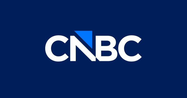
In its place, the network debuted a refreshed logo, described as “a more modern look that simplifies the design while keeping its identity familiar and timeless.”
Designed in-house by one of the network’s senior designers, the new logo incorporates an arrow symbol familiar to regular viewers, which the network uses in its on-air graphic package to indicate positive or negative movement in the business market.
Robert Poulton, CNBC’s head of creative, spoke with TVNewser about the logo refresh for our final 5 Questions For… series for 2025. Poulton noted that, throughout the design process, they were committed to protecting CNBC’s word mark equity, “whose clarity and recognition have long anchored our identity.”
TVNewser: What was the thought process behind the new design?
Poulton: Moving away from the NBC Peacock, an icon embedded in the network’s visual identity for decades, required us to think boldly about how CNBC shows up in the world. Without that familiar symbol, the design process became an exploration of what visual cues could represent CNBC on its own terms: something modern, purposeful, and rooted in the brand’s authority in business news.
We set out to create a logo that modernizes CNBC while preserving the legacy that has defined the network for more than three decades. Our exploration covered a wide range of ideas—symbols of ambition, upward momentum, global perspective, mascots, navigation, and financial movement—as we searched for the most authentic expression of who we are and what we stand for. Through that process, we remained committed to protecting the equity of the CNBC word mark, whose clarity and recognition have long anchored our identity. We also wanted a symbol that signaled progress and purpose while fitting seamlessly into our network’s visual language. The result is a refined word mark paired with the new Tick Marker, an upward-driven form built from the square, the foundational shape of our entire design system.
How many designs did you go through before the final version?
Arriving at the final mark required an extraordinarily expansive creative process. We explored hundreds of design approaches—testing a wide range of symbols, structures, and visual metaphors—to fully understand the breadth of what CNBC could become. That rigorous exploration helped reveal what felt true to the brand, what honored our legacy, and what best expressed the ambition and clarity at the core of our identity, ultimately guiding us to the mark we introduced today.
How long did the entire process take?
From assignment to final approval, the entire process took about 7 months.
What makes designing a new logo so tricky?
Redesigning the logo of an iconic brand is inherently challenging because it requires balancing decades of recognition with the need for meaningful evolution. Every decision carries weight—what to preserve, what to refine, and what to rethink entirely—while ensuring the final mark still feels unmistakably true to the brand. This work demands precision, restraint, and a deep understanding of both legacy and future potential. It places the design team squarely in what [Theodore] Roosevelt called “The Arena”—doing the hard, thoughtful, scrutinized, and often unseen work required to move a storied brand confidently into its next chapter.
So you must have confidence in your internal design team?
We’re fortunate to have a small but exceptionally talented brand design team that is deeply committed to how CNBC shows up in the world and across each platform. Their expertise, rigor, and dedication to the CNBC brand have been central to this project and continue to elevate CNBC’s visual identity. I have complete confidence in their ability, thoughtfulness, creativity, and a strong sense of responsibility for the work we put into the world.
